

Scribble-based forecasting and AI 2027
math or intuition?
dynomight.net/scribbles ← If you share this post, kindly use this URL.

AI 2027 forecasts true AGI could plausibly arrive as early as 2027. I recently spent some time looking at both the timelines forecast and some critiques [1, 2, 3].
Initially, I was interested in technical aspects of the forecast. What’s the best super-exponential curve? How much probability should it have? But I found myself drawn to a more basic question. Namely, how much value is the math really contributing?
This provides an excuse for a general rant I’ve long wanted to make. Say you want to forecast something. It could be when your hair will go gray, or if Taiwan will be self-governing in 2050, whatever. Here’s one way to do it:
Think hard.
Make up some numbers.
Don’t laugh—that’s the classic method.
Alternatively, you could use math:
Think hard.
Make up a formal model / math / simulation.
Make up some numbers.
Plug those numbers into the formal model.
People are often skeptical of intuition-based forecasts because, “Those are just some numbers you made up.” Math-based forecasts are hard to argue with. But that’s not because they lack made-up numbers. It’s because the meaning of those numbers is mediated by a bunch of math.
So which is better, intuition or math? In what situations?
Here, I’ll look at that question and how it applies to AI 2027. Then I’ll build a new AI forecast using my personal favorite method of “plot the data and scribble a bunch of curves on top of it”. Then I’ll show you a little tool to help you make your own artisanal scribble-based AI forecast.
Two kinds of forecasts
To get a sense of the big picture, let’s look at two different forecasting problems.
First, here’s a forecast (based on the IPCC 2023 report) for the mean change in Earth’s temperature up until 2100. There are two curves, corresponding to different assumptions about future greenhouse gas emissions.
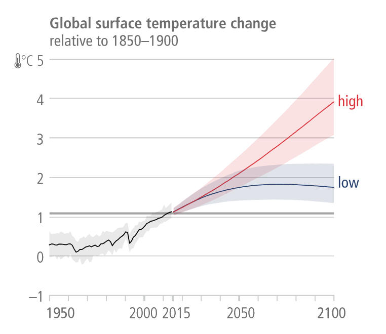
Those curves look unassuming. But there are a lot of moving parts behind them. These kinds of forecasts model atmospheric pressure, humidity, clouds, sea currents, sea surface temperature, soil moisture, vegetation, snow and ice cover, surface albedo, population growth, economic growth, energy, and land use. They also model the interactions between all those things.
That’s hard. But we basically understand how all of it works, and we’ve spent a ludicrous amount of effort carefully building the models. If you want to forecast global surface temperature change, this is how I’d suggest you do it. Your brain can’t compete, because it can’t grind through all those interactions like a computer can.
OK, but here’s something else I’d really like to forecast:

I’m very interested in where that blue line is going to go.
You could forecast this using a “mechanistic model” like with the climate model above. To do that, you’d want to model the probability Iran develops a nuclear weapon and what Saudi Arabia / Turkey / Egypt might do in response. And you’d want to do the same thing for Poland / South Korea / Japan and their neighbors. You’d also want to model future changes in demographics, technology, politics, economics, military conflicts, etc.
In principle, that would be the best method. As with climate, there are too many possible futures for your tiny little brain to work through. But building that model would be very hard, because it basically requires you to model the whole world. And if there’s an error anywhere, it could have serious consequences.
In practice, I’d put more trust in intuition. A talented human (or AI?) forecaster would probably look at the above curve and take some “outside view” like, “Over the last 80 years, the number of countries has gone up by 9, so in 2105, it might be around 18.” Then, they’d consider adjusting for things like, “Will other countries might learn from the example of North Korea?” or “Will chemical enrichment methods become practical?”
Intuition can’t churn through possible futures the way a simulation can. But if you don’t have a reliable simulator, maybe that’s OK.
Broadly speaking, math/simulation-based forecasts shine when the phenomena you’re interested in has two properties.
It evolves according to some well-understood rule-set.
The behavior of the ruleset is relatively complex.
You need the first, because if you don’t have a good model for the ruleset (or at least your uncertainty about the ruleset), how will you build a reliable simulator? You need the second because if the behavior is simple, why do you even need a simulator?
The ideal thing to forecast with math is something like Conway’s game of life. Simple known rules, great emergent complexity. The worst thing to forecast with math is something like the probability that Jesus Christ returns next year. You could make up some math for that, but what would be the point?
The AI 2027 forecast
This post is (ostensibly) about AI 2027. So how does that forecast work? They actually have several forecasts, but here I’ll focus on the Time horizon extension forecast.
That forecast builds on a recent METR report. They took a set of AIs released over the past 6 years, and had them try to complete a set of tasks of varying difficulty. They had humans perform those same tasks. Each AI was rated according to the human task length that it could successfully finish 50% of the time. Here’s the first figure from that report, which you may have seen already.

The AI 2027 team figured that if an AI could successfully complete long-enough tasks of this type, then the AI would be capable of itself carrying AI research, and general superhuman AI would not be far away. Quantitatively, they suggest that the necessary length is probably tasks that take somewhere between 1 month and 10 years. They also suggest you’d need a success rate of 80% (rather than 50% in the above figure).
So, very roughly speaking, the forecast is based on predicting how long it will take these dots to reach up to one of the horizontal lines:

(It's a bit more complicated than that, but that's the core idea.1)
I think this framing is great. Instead of an abstract discussion about the arrival of AGI, suddenly we’re talking about how quickly a particular set of real measurements will increase. You can argue if “80% success at a 1-year task horizon” really means AGI is imminent or not. But that’s kind of the point—no matter what you think about broader issues, surely we’d all like to know how fast those dots are going to go up.
So how fast will they go up? You could imagine building a mechanistic model or simulation. To do that, you’d probably want to model things like:
How quickly is the data + compute + money being put into AI increasing?
How quickly is compute getting cheaper?
How quickly is algorithmic progress happening?
How does data + compute + algorithmic progress translate into improvements on the METR metrics?
How long will those trends hold? How do all those things interact with each other? How do they interact with AI progress itself.
In principle, that makes a lot of sense. Some people predict a future where compute keeps getting cheaper pretty slowly and we run out of data and new algorithmic ideas and theoretical metrics stop translating to real-world performance and investment drops off and everything slows down. Other people predict a future where GPUs accelerate and we keep finding better algorithms and AI grows the economy so quickly that investment increases and everything spirals into a singularity. In between those extremes are many other scenarios. A formal model could churn through all of them much better than a human brain.
But the AI 2027 forecast is not like that. It doesn’t have separate variables for compute / money / algorithmic progress. It (basically) just models the best METR score per year.
That’s not bad, exactly. But I must admit that I don’t quite see the point of a formal mathematical model in this case. It’s (basically) just forecasting how quickly a single variable goes up on a graph. The model doesn’t reflect any firm knowledge about subtle behavior of the variable other than that the curve goes up.
In a way, I think this makes the AI 2027 forecast seem weaker than it actually is. Math is hard. There are lots of technicalities to argue with. But their broader point doesn’t need any math. Say you accept their argument that 80% success on the METR measurement at tasks that take humans 1 month / 1 year / 10 years means that AGI is imminent. Then you should believe AGI is around the corner unless those dots slow down. An argument that their math is flawed doesn’t imply that the dots are going to stop going up!
Scribble-based forecasting
So, what’s going to happen with those dots? The ultimate outside view is probably to not think at all and just draw a straight line. When I do that, I get something like this:

I guess that’s not terrible. But personally, I feel like it’s plausible that the recent acceleration continues. I also think it’s plausible that in a couple of years we stop spending ever-larger amounts on training AI models and things slow down. A lot of things seem possible. For a forecast, I want a probability that a certain threshold is reached by a given year.
So I took the above dots and I scribbled 50 different curves on top, corresponding to what I felt were 50 plausible futures:
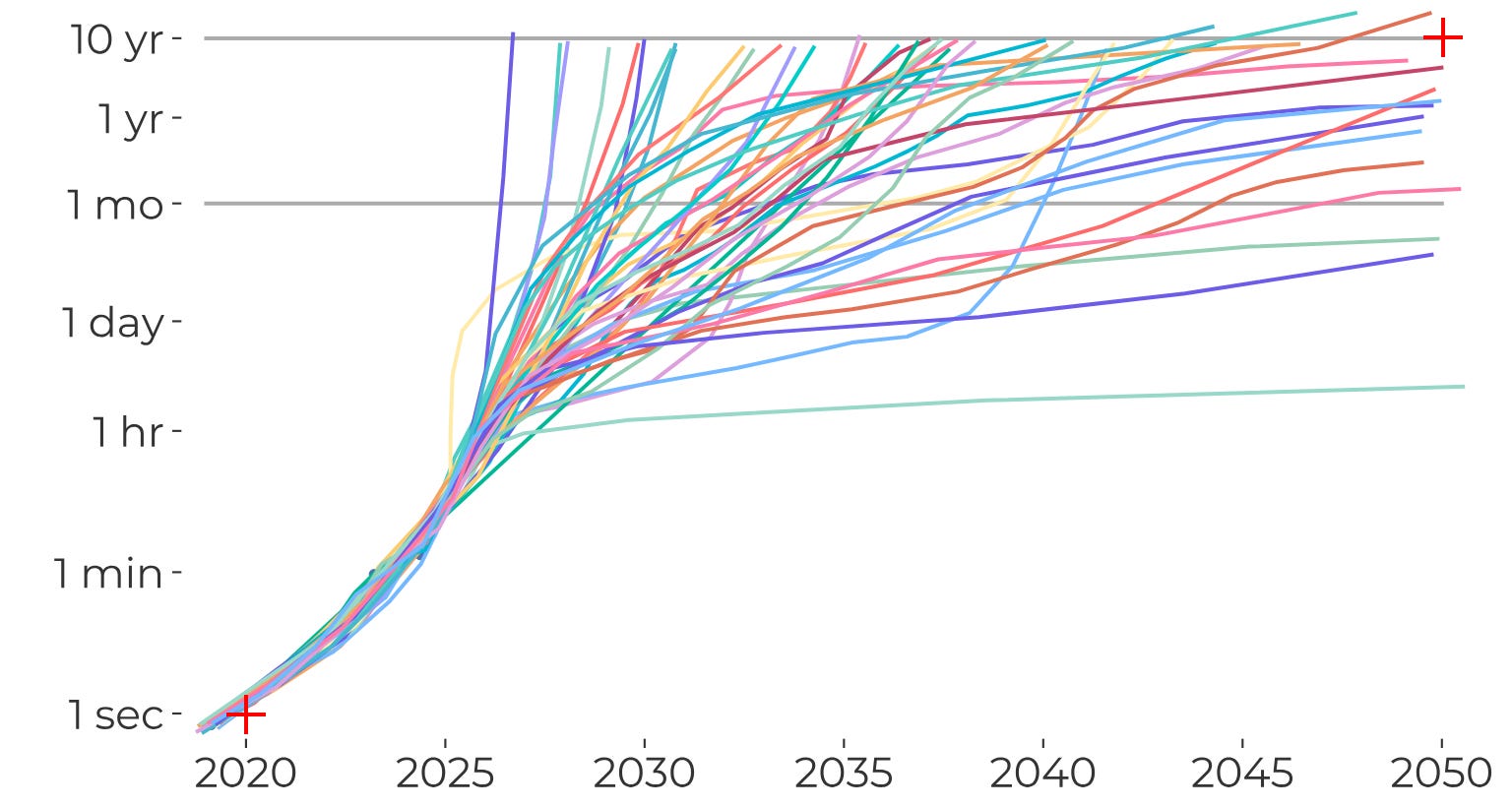
Then I treated those lines as a probability distribution over possible futures. For each of the 1 month, 1 year, and 10 year task-horizon thresholds, I calculated what percentage of the lines had crossed over that threshold by a given year.

Or, here’s a summary as a table:

My scribbles may or may not be good. But I think the exercise of drawing the scribbles is great, because it forces you to be completely explicit about what you’re predicting.
I recommend it. In fact, I recommend it so strongly that I’ve created a little tool that you can use to do your own scribbling. It will automatically generate a plot and table like you see above. You can import or export your scribbles in CSV format. (Mine are here if you want to use them as a starting point.)
Here’s a little video:
While scribbling, you may reflect on the fact that the tool you’re using is 100% AI-generated.
Technical notes.
The AI 2027 team raises the success rate to 80%, rather than 50% in the original figure from the METR report. That’s why the dots in the above figure are a bit lower.
I made the above graph using the data that titotal extracted from the AI 2027 figures.
The AI 2027 forecast creates a distribution over the threshold that needs to be reached rather than considering fixed thresholds.
The AI 2027 forecast also adds an adjustment based on the theory that companies have internal models that are better than they release externally. They also add another adjustment on the theory that public-facing models are using limited compute to save money. In effect, these add a bit of vertical lift to all the points.
Love the scribbling averager, that’s super useful.
I feel it’s important to clarify that the reason it’s important/better to attach some math to your forecast when you can is not JUST because it can handle well-defined rules, but also because it allows you to check your conclusions against any existing data (not just a rule, the model is the rule) and generalize out of distribution in a principled fashion. To post-dict as well as predict.
Related to this, one of the most devastating problems pointed out with AI 2027 was its extreme insensitivity to some of the initial conditions. This seems like a flaw, which was revealed by probing the math model, thus demonstrating the utility of attaching some (possibly made up) math to it.
TL;DR on Scribbling: Does Monte Carlo simulation sound too technical? What if we call it Scribble-based forecasting?