A visual summary of economic growth since the industrial revolution
I used to have a mental model that economic growth was about:
Figuring out clever ways to do stuff.
Doing it.
Rich countries are at the technological frontier, so they have to do both of these things at the same time. Since figuring things out is hard, they can’t grow too quickly. But poorer countries can grow faster by just adopting the best ideas from elsewhere.
This seems to explain how places like Japan and South Korea grew quickly and gradually slowed as they caught up with rich countries.
Except… this can’t possibly be right. If it was, how did rich countries get rich in the first place?
We need a better model. Usually, you need more than an idea to do stuff, you need other stuff, like machinery, buildings, roads, electrical grids, legal systems, or skilled people. Maybe you can copy an idea, but you need to make that other stuff.
So maybe economic growth is about:
Figuring out clever ways to do stuff.
Having the capital to do it.
Doing it.
Rich countries have expensive labor but lots of capital. So they innovate by finding ways of throwing ever-larger amounts of capital around to squeeze ever-higher productivity out of their workforce. But poorer countries have little capital and cheap labor, meaning these innovations aren’t always useful to them.
So maybe richer countries tend to grow faster?
I got interested in these questions after reading Global Economic History by Robert Allen. He offers this graph of the growth of different regions of the world between 1820 and 2008:
The vertical axis is the ratio of per-capita GDP in 2008 and 1820.
Sure, Allen concedes, Japan and South Korea grew quickly and caught up, and maybe China is doing the same now. But those are just exceptions—the overall trend is that rich countries grew faster. Writing in 2011 he says:
Between 1820 and the present, the income gaps have expanded with only a few exceptions.
At first, I was skeptical of this. At a minimum, doesn’t it violate the concept of comparative advantage? Well, no. In this theory, the poorer countries do tend to grow, they just do it slower, so the gap with rich countries tends to increase.
Allen suggests that unless the local industry is protected by tariffs, comparative advantage will push them towards low-capital activities. This means they can’t get off the ground and start building capital and adopting more advanced technologies.
Sometimes competition from rich countries can make poorer countries move “backward”. For example, after the industrial revolution, exported manufactured goods from Britain led to a de-industrialization of much of Asia and Africa.
Is this right? Are richer countries getting ever further ahead of poorer countries? How could this be true, when none of the countries where per capita GDP grew the quickest between 2010 and 2018 were particularly rich?
6-7% - China, Myanmar
5-6% - India, Bangladesh
4-5% - Panama, Rwanda, Sudan, Ghana, Turkey, Phillippines, Dominican Republic, Indonesia, Nicaragua, Cote d’Ivoire, Nepal
To find the true causes of economic development around the planet over the last two hundred years is, like, hard. But it should be possible to at least describe what has already occurred. So I decided to take a look at the data.
In this post, I’ll argue that all of the above graphs are wrong. Historically, poor countries have grown at about the same rate as rich countries, on average. But replacing the above graphs with a flat line would still be misleading. There is a difference: Rich countries all grow at basically the same smooth and steady rate. While some poor countries have super-fast catch-up growth, others barely grow at all or even shrink. Poor countries have the same mean but higher variance.
Cartoon model
Before getting to the results, I’ll summarize what I think is true using three cartoon figures. First, here’s what the world looked like in the dismal past before the industrial revolution:
All countries were pretty poor, and there wasn’t much growth anywhere. Even in countries that had huge empires around the globe, life wasn’t obviously getting better over time (as measured by per-capita GDP).
Next here’s what things looked like for the first century after the industrial revolution (1820-1920):
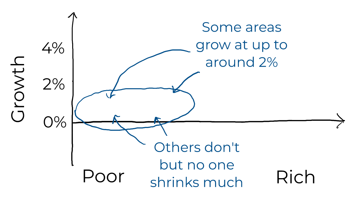
During this period, the average level of growth increased to maybe 1%. That happened through some countries growing by as much as 2% and other countries staying nearly constant. There’s no obvious trend between how rich a country is and how quickly it grew.
Finally, if we look at the last century (1920-2018), things start to look sort of like a pear tipped on its side:
The average growth rate increased a bit, to around 1.5 or 2%. Again, there’s little obvious trend in terms of rich countries growing faster or slower. What is obvious is how the variance in growth changes. The richest countries grow at stable modest rates. Middle-income countries sometimes have enormous “catch-up” growth, sometimes grow at average levels, and sometimes even shrink.
Data
For the rest of this post, I’ll analyze data from the excellent Maddison Project which is dedicated to collecting very long-term data on economic growth and income levels.
Note that I’m focusing entirely here on economic growth in per-capita terms. There was a steady pace of major inventions before the industrial revolution, but these often didn’t manifest as increased per-capita wealth. That’s likely because the world was caught in a Malthusian trap where technological advancement only led to a larger population.
The dismal past
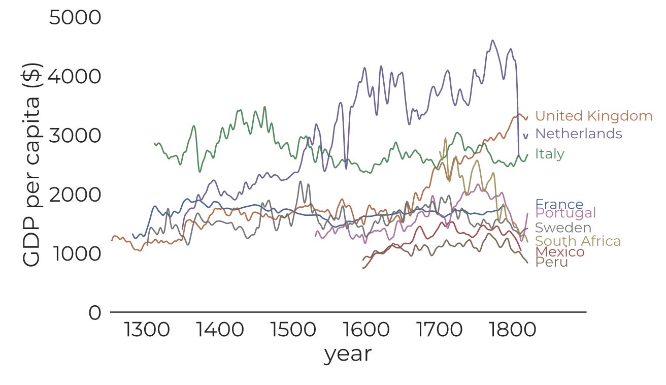
Here’s the long-term history for the few places where we have data:
Broadly speaking, nothing happened. During this time, the United Kingdom and the Netherlands basically took over the planet and still only increased per-capita income by a factor of around 3 over 500 years—annual growth of only 0.2%. Most places couldn’t use that trick and didn’t grow at all.
Setting the stage
The industrial revolution started in Britain in around 1760 and finished between 1820 and 1840. Here’s a histogram of per-capita GDP in different countries over the next two centuries (weighted by population, with a logarithmic horizontal axis):
The gap between the richest and poorest countries has increased a lot.
Great, but how did this happen?
Growth analysis
We can of course try to make plots of GDP in countries over time:
This is fine, but it’s not clear what to conclude other than that 200 years rolled past and at the end some places were rich and some weren’t. We need insight into what path countries took to end up at the top or at the bottom of the graph.
Do understand this, let’s break things down into 50 year periods. (The reason for this is that GDP growth is noisy at short timescales, but tends to smooth out over time—look at how wiggly the curves are in the above graph.)
1820-1870
Here’s the growth in different countries between 1820 and 1870. Countries are sized according to their population at the end year and colored by region. (The US, Canada, Australia, and New Zealand are included with Europe.)
(Click here for country labels.)
Roughly speaking, in this period, some countries start to grow at around 1%, mostly in Europe and the Anglosphere. Many other countries don’t grow much at all.
1870-1920
The next 50 years are similar except growth rates start to pick up a bit:
1920-1970
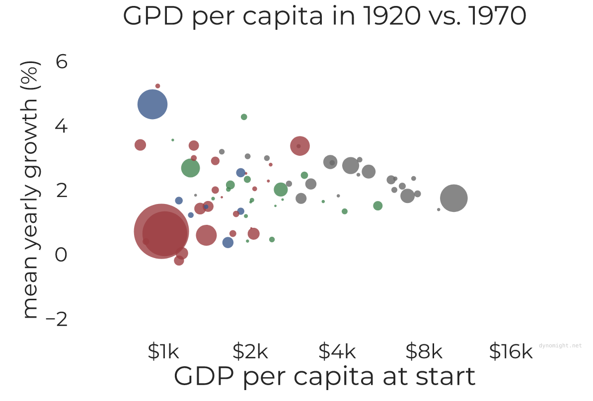
Starting around 1920, things began to look different.
During this period, the average country grew by something like 2%. Some less rich countries do seem to show rapid catch-up growth. But this doesn’t really happen on average, it’s just that there’s more variance for less rich countries.
1970-2018
This trend is even more pronounced after 1970:
After 1970, there is a new and dispiriting trend where some countries experience long-term economic decline. For countries near subsistence incomes, this is rare, perhaps because there’s not much to lose. On the other hand, some middle-income countries grow very quickly. The richest countries mostly keep growing at the same 1.5 or 2% they’ve been averaging since the industrial revolution.
Conclusions
First, it’s well known, but still: It’s amazing that the richest countries have grown at nearly the same rate for 200 years. Despite year-by-year variation, it always seems to average out to 1.5-2%. Why? In 1820, 72% of Americans worked on farms. Then came bicycles, reaping machines, blast furnaces, steam shovels, pneumatic drills, boring machines, reinforced concrete, plastics, pasteurization, dynamite, phonographs, light bulbs, arc welding, steam turbines, x-rays, aircraft, the Haber-Bosch process, trams, subways, cars, penicillin, radio, television, transistors, nuclear power, computers, satellites, lasers, spacecraft, video games, cell phones, and the internet. Now less than 1% work on farms. How do all these revolutions average out to produce smooth and steady growth? It’s crazy.
Second, you might expect the industrial to have diminishing returns, but that’s not what we see. If anything, the mean level of growth seems to be gradually increasing. It was around 1% from 1820 to 1920 and around 2% from 1920 to 2018. (This depends on if you use population weighting or not—check the graphs linked in the previous paragraph for details.)
Third, at any given time, there’s little relationship between how rich a country is and how fast it grew on average. I did try fitting trendlines (1820-1870, 1870-1920, 1920-1970, 1970-2018). These vaguely suggest that rich countries tended to grow faster in earlier years, while middle-income countries tended to grow faster in more recent times. However, that’s largely due to the influence of India and China. If you do the same thing without weighting (1820-1870, 1870-1920, 1920-1970, 1970-2018) you don’t see much of a trend either way.
However—fourth—over the last century there’s a huge relationship between how rich a country is and the variance in growth. The richest countries have low variance: They all stubbornly keep growing at around the same 1 or 2%. However, middle-income countries vary enormously.
So is catch-up growth real? I think so. Many middle-income countries have managed to grow at 6% for decades at a time, but no country at the technological frontier has ever managed much more than 2%. In this way, middle-income countries definitely can catch up.
So if you’re a country, how do you catch up? All you need to do is:
Grow faster than 2%.
Don’t stop growing faster than 2% until you’re rich.
In theory, the rate of growth doesn’t matter in the long run. If you grow at 4% rather than 6% it will take longer to catch up, but you’ll still get there. The critical part is that growth doesn’t falter before you’re done catching up. In reality, it gets harder to maintain 4% as you get closer to the frontier, so this isn’t as easy as it sounds.
The opposite of catch-up growth is also possible. Many middle-income countries have weak growth or even shrink. Between 1970 and 2018, Botswana, Equatorial Guinea, and Taiwan grew by 5% or more, while the Central African Republic, Mozambique, Syria, and Venezuela all shrank quite a lot. Catching up is possible, but it’s not some automatic natural law, it’s something you have to do.
Thanks to everyone who sent in proofs for the conspiratorial Monty Hall problem. I’m going to try to organize them into the different basic proof strategies and post an update soon.


Probably worth considering impacts of colonial extraction in models... but I'm no economist.
Really giving slatestarcodex a run for his money here :)
In general, there seems to be a selection effect among economists to favor spherical cow models. I suppose folks without the spherical cow bias tend to prefer working in business directly to theorizing from the remove of ivory towers.